Agatha Christie used to say of her novels that her self-imposed structures and rules limited the stories she could tell and forced her to become more creative within that structure. It forced her to tease a character’s essence out in a sentence or two rather than in paragraphs of character development.
The same could be said of print advertising.
A copywriter and an art director sit down and have to find some combination of words and pictures that captures that ephemeral thing that is a brand, connect with the reader, and then solve their problem. And that has to happen within the bleeds of an 8.5” x 11” sheet of paper. Understanding what makes print advertising successful can be applied to all forms of advertising, from TV spots to direct mail, because the challenges remain the same. These are our 3 favorite print ads from the past year. What’s more, they’re ads that didn’t require gigantic production budgets.
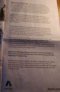
Aereo and the New York Times Information War
Aereo is a startup that has had a rough year because they provide a service that is disruptive. By installing tiny antennae in a data center, they are able to pull high-definition broadcast signal out of the air on your behalf, much like an antenna on your roof would. They then stream this signal over the Web to the subscriber. The New York Times had been following the story of impending lawsuits by cable providers for a couple of weeks, and on this day, they released the story that Aereo had been cleared by the circuit court to do business. And on the first interior page in the Times, on the same day, this ad. This is, above all, a great example of using advertising to change the conversation about your business. Supplementing news coverage with advertising increases the value of both.
The Topless Beetle
 Volkswagen has had a year of great advertising, but one that stands out is the Topless Beetle advertisement for the Cabriolet. Like Coke’s bottle, the Beetle shape is the brand’s most recognizable aspect. Cutting half of the dome off might have been off-brand, but not when it’s introduced like this. The blurred area where the dome should be allows the reader to complete the picture and visualize the shape of the dome and see that it really is the same car.
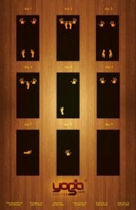
Yoga Shelter’s Master Yogi
 Here’s another great ad that takes the reader 80% of the way to the answer and allows the reader’s imagination fill in the other 20%. This ad captures yoga’s core value — you’ll get stretchy and have better balance — and takes it to its logical, but preposterous, end. The result is an easy-to-enjoy ad that offers a chuckle at the end. Maybe it gets torn out of the magazine and put on the fridge or the office bulletin board.
Awards shows are full of print work done by great artists with a production budget in the tens of thousands of dollars, but often the best print work requires little more than basic graphic design and copy. Our three examples of ads we love range from all copy to no copy and include an ad without any art, one made by a photographer, and one made by an illustrator. Companies will often find that the best advertising is strategic and aims to solve a consumer’s problem.
Cutting through the clutter is as difficult in direct mail as it is in print. Unlike some highly-conceptual print advertising, any of these concepts could be easily adapted into a direct mail piece, like a simple letter in the first case and a postcard for the second two pieces. Finding intrusiveness in their simplicity, they easily convey the advertiser’s message in the two seconds we have as advertisers between looking at the mail and the mail hitting the bin.
I'm the Director of Digital Services and Partner at Ballantine, a family-owned and operated direct mail & digital marketing company based in New Jersey. and started in 1966 by my great uncle!


