Words are powerful. What you say — and how you say it — can completely change the meaning of your message. In the design world, we take this idea one step further. After all, if a picture is worth a thousand words, it only makes sense that words themselves create pictures that captivate their audiences and tell their own stories. This is what branding and messaging are all about.
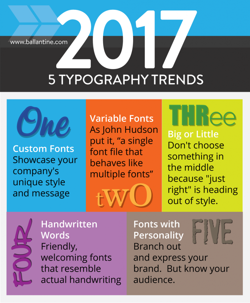
In honor of the written word and all of the powerful things words can say, we wanted to bring you 2017’s top typography trends:
1. Custom Fonts
In today’s world, everybody wants something that’s personalized and custom, and fonts are no different. While it may be a bit of a heftier investment up front, custom fonts have the ability to showcase a company’s style and message unlike anything that comes from a template.
If you can create a custom font that’s enjoyable enough to look at regularly and tells a story about your company, your words will go a long way when it comes to reputation-building with your customers.
2. Variable Fonts

Source: Smashing Magazine (Jake Wilson)
This past fall, industry leaders Microsoft, Adobe, Apple, and Google came together with the open source world to create OpenType, a new technology that’s built with input from independent font and toolmakers. OpenType fonts allow web designers and app developers to use small font files while still delivering rich typographical experiences. Creators can build large palettes of typography features without necessitating hundreds of font files.
Long story short, variable fonts provide a flexible solution that allows designers to do what they do best without muddling the content. Variable fonts are responsive design’s answer to typography.
3. Big or Little
Goldie Locks isn’t coming to the party in 2017. There’s nothing that’s too big, too small, and just right. This year’s trend leans one way or the other. For some brands, big bold letters help get the message across. For other companies, small lettering lends itself to more white space upon which you can place other content such as images, videos, or words. Of course, you could always go for the minimalist vantage point and leave your white space white.
What matters most is that you don’t settle for something in the middle because “just right” is heading out of style.
4. Handwritten Words
Source:: Ndro Adv
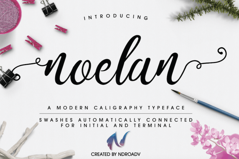
Fonts that resemble actual handwriting are surfacing as a major element in brand marketing this year. In this day of digitally-read everything, consumers respond well to the welcoming, friendly nature which is delivered with handwritten font types. Sharpie figured this out a long time ago — long before the digital era came into play. Now they’re one of the biggest players of the handwritten logo.
5. Fonts with Personality
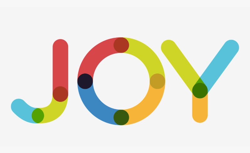
Source: Ivan Filipov
Times New Roman and Arial certainly have their places in the business world, but if you’re looking for a way to branch out and express your brand, you need to get creative. Know your audience. If your people are more buttoned-up and by-the-book, traditional fonts will likely do well for your business. However, if your audience is filled with creatives, go for interesting fonts that bring a bit of intrigue and personality.
Before You Leave, Take these Key Takeaways with You:
- Customize your brand.
- Embrace variable fonts and everything necessary to optimize responsive design.
- Go big, go little, or go home. There’s no in-between.
- People respond to the personal nature of handwritten words.
- Impart personality in everything you do, including your written words.
Your business has something to say, and the last thing you want to do is leave your brand in the hands of amateurs. At Ballantine, our team of professionals has been the best at making creative things come to life since 1966. we’re not new at this game, but we love adding new clients to our roster. Take a look at our samples, and reach out to us when you’re ready to take your typography and print to the next level!
I'm the Director of Digital Services and Partner at Ballantine, a family-owned and operated direct mail & digital marketing company based in New Jersey. and started in 1966 by my great uncle!

